introduction to Tableau desktop:
Tableau Desktop is a business intelligence tool which is also an interactive data visualization software company founded by Christian Chabot, Part Hanrahan, and Chris Stolte in the year 2013. Tableau is a visual analytics solution that allows people to explore and analyze data with simple drag-and-drop operations. The important point is that any user can connect to the Tableau desktop and be able to perform reporting and analysis and reporting very effectively and accurately. Tableau Desktop is very easy-to-use as Microsoft Excel so that even non-programmer can learn this tool without the knowledge of programming. After all, this is one of the powerful business intelligence tools to solve any complex analytical problems. Tableau desktop has its own patent query language called “VIZQL” or (Visualization Query language).
Become a master of Tableau by going through this HKR Tableau Training
Tableau chart types:
In the tableau, we can create up to 24 different chart types. The following are the various Tableau charts which we are going to explain in brief:
1. Area chart in Tableau:
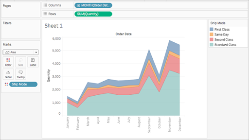
An area chart is a type of line chart where we can get the area between the line and the axis which are shaded with different colors. The area charts are used to represent the total area over time and display stacked lines. Follow the below steps to create an area chart in Tableau:
The basic fundamental building blocks to create an area chart:
1. Mark type: Area
2. Columns shelf: Dimension
3. Rows shelf: Measure
4. Colour: Dimension
Important steps to create an area chart:
a. First open the tableau desktop -> then connect to the sample superstore data source.
b. Then navigate to the new worksheet.
c. From the data pane -> drag the order data -> to the columns shelf.
d. On the column shelf -> right-click YEAR (order date) -> then a select month.
e. Then from the data pane -> drag the quantity to the rows shelf.
f. From the data pane -> drag the ship mode -> shift the color on the marks card.
g. Then go to the marks card -> click the mark type drop down method -> choose the area.
The final visualization will be seen as follows;
2. Bar chart in Tableau:
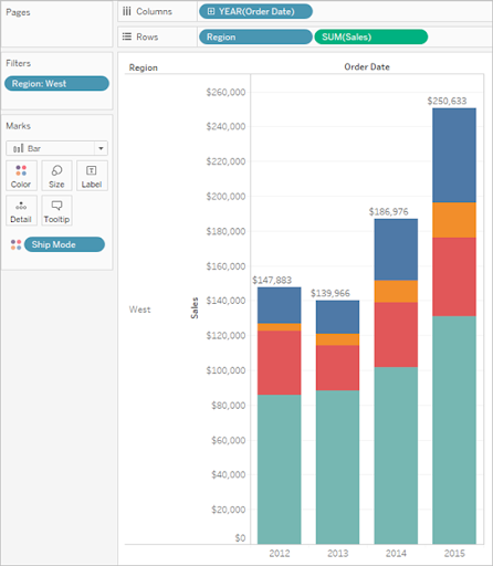
We use a bar chart to compare any two data across various categories. You need to create a bar chart just by placing the dimension on the rows shelf and measuring them on the column shelf.
A bar chart makes use of bar mark type. Tableau chooses the mark type when the two data views match the field arrangements.
There are two types of bar chart available:
a. Create the vertical bars
b. Create the horizontal bars
The following are the important steps involved to create a bar chart:
1. First connect to the sample -> superstore data source.
2. Then go to the analytics pane -> drag the reference line into the view -> then drop them on the cell.
3. Go to the Edit line, band, and box dialog -> then set the aggregation SUM, set the Label to value, set Line to none.
4. Then click on the “OK” button to close the Edit reference line, box, and band dialog box.
5. Then right-click on any of the totals in the bar chart -> then select Format.
6. In the format window -> go to the reference line label area -> then open the alignment control -> select the center horizontal alignment.
The final output will be seen like this;
3. Build a box plot:
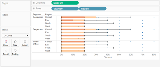
This box plot can also be known as box and Whisker plots, which are used to distribute the values on-axis. The box plot indicates 50 percent of the data. Here you need to configure the lines called whiskers and adjoin the maximum extent of the data.
The following are the basic building blocks of the box plot;
1. Mark type: Circle
2. Columns shelf: Dimension
3. Rows shelf: Measures
4. Detail: Dimension
5. Reference line: Box plot.
The following are the important steps to create a box plot:
a. First connect to the sample –> then go to the superstore data source.
b. Then drag the segment dimension –> to the columns shelf.
c. Then drag the discount measure to rows.
d. Drag the region dimension to columns -> then drop it to the right segment.
e. Then click the show tab in the toolbar, -> then choose the box and whisker plot chart type.
f. Drag the region from the marks card -> back to the column shelf to the right segment.
g. To disaggregate the data value -> then choose the analysis -> aggregate measures.
h. Click on the swap button used to swap the axes.
i. Right-click on the bottom axis -> select the edit reference line.
j. Go to the edit reference line -> fill the drop-down list -> then select the color scheme.
4. Build a bullet graph:
A bullet graph is a type of variation of a bar graph mainly developed to replace dashboard gauges and dashboards. A bullet graph is mainly used to perform primary measures to perform one or more other measures.
The following steps are required to build a bullet graph:
1. First open the tableau desktop -> then connect to the “world indicator” data source system.
2. Then navigate the new worksheet.
3. Hold down shift on the keyboard -> under the development -> choose the tourism inbound and tourism outbound.
4. Go to the upper right corner of the application -> click on show me.
5. In the show me tab -> choose the bullet graph image.
6. Then click show me to close the tab.
7. In the region shelf to drag the region and data pane.
The output will be shown as follows;
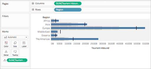

Tableau Certification Training
- Master Your Craft
- Lifetime LMS & Faculty Access
- 24/7 online expert support
- Real-world & Project Based Learning
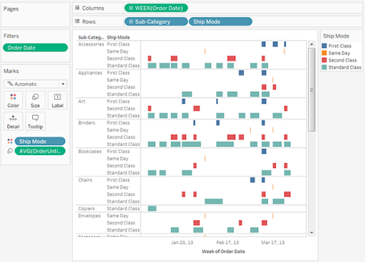
5. Grantt chart in Tableau:
Use this Grantt chart to show the event and activity duration. If you are working with the Grantt chart, each separate bar mark shows a duration.
The basic building blocks of the grantt chart are as follows:
1. Mark type: Automatic or grant bar
2. Column shelf: Date or time field measure
3. Rows shelf: Dimensions
4. Size: Continuous measure
To build a grant chart you have to follow the below steps:
1. First connect to the sample -> go to the super store data source.
2. Then drag the order date dimension available to columns.
3. Go to the column shelf -> click the year drop-down arrow -> then choose the week number.
4. Then drag the sub-category section and ship mode dimensions -> drop the ship mode to the right sub-category.
5. In the toolbar menu -> click on analysis -> create the calculated field -> right-click on any field in the data pane –> choose to create the calculated field.
6. In the calculation box –> name your order until the ship calculated field.
7. Clear the content in the formula box.
8. In the formula box, then enter the following formula –> click the OK button.
9. Now drag the order until the ship used to measure the size on the marks card.
10. Right-click on the SUM fields on the Marks card –> then select measure -> average.
Want to know more about Tableau, visit here Tableau Tutorial

Subscribe to our YouTube channel to get new updates..!
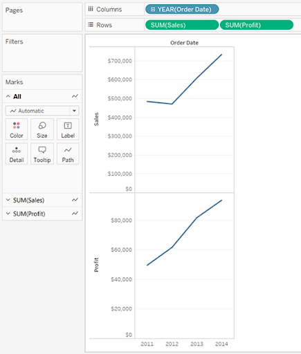
6. Build a Line chart in Tableau:
The line chart is mainly used to connect individual data points in a view. This will help to visualize a sequence of data values and more useful to trend over time, forecast to future values.
The below are the few steps to follow the line chart in Tableau:
1. First connect to the sample -> then super store data source.
2. Then drag the order date dimension available in columns.
3. Then drag the sales measure to the row shelf.
4. Drag the profit measures to row shelf -> then drop it to the right sales measure.
5. Drag the SUM profit field from the Rows shelf to the sales -> then create a blended axis -> then you will see two pale green parallel bars -> this indicates the profit and sales.
6. Click on the drop-down arrow field on the column shelf -> then select the field in the lower part of the context menu.
7. To add a forecast in the analytics panel, then drag the forecast model to view and then drop it on the forecast field.
The output will be seen as follows;
Top 30 frequently asked Tableau Interview Questions !
Conclusion:
From this Tableau Chart blog, you will be learning various chart and graph types. With the help of this blog, you can create your own or customized data values and visualizations. The tableau chart is a sub-product type of Tableau desktop and child product of Microsoft corporations. You can make use of your own choice of charts on the basis of different categories such as sales, marketing, product-wise, and customer support. Learning this content may help you to gain more knowledge in Tableau products and apply the methods in your organization.
Related Articles:
About Author
As a senior Technical Content Writer for HKR Trainings, Gayathri has a good comprehension of the present technical innovations, which incorporates perspectives like Business Intelligence and Analytics. She conveys advanced technical ideas precisely and vividly, as conceivable to the target group, guaranteeing that the content is available to clients. She writes qualitative content in the field of Data Warehousing & ETL, Big Data Analytics, and ERP Tools. Connect me on LinkedIn.
Upcoming Tableau Certification Training Online classes
| Batch starts on 6th May 2026 |
|
||
| Batch starts on 10th May 2026 |
|
||
| Batch starts on 14th May 2026 |
|

