
Power BI Matrix
Last updated on Jan 24, 2024

What is the Power BI Matrix?
The visual of the matrix is identical to that of a table. The data in a table is flat, which ensures that duplicate values are shown and not aggregated. A matrix supports a stepped structure, which makes it easier to view data meaningfully across multiple dimensions. The matrix aggregates the data for you and helps you to dig down into it.
Why Power BI Matrix?
The matrix aggregates the data automatically and allows for drill-down. In Power BI Desktop reports, you can create matrix visuals and highlight elements inside the matrix with other visuals on the same report page. You may, for instance, cross-highlight rows, columns, and even individual cells. Individual cells, as well as different cell selections, can be copied and pasted into other applications.
Understanding the Data:
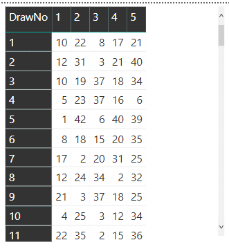
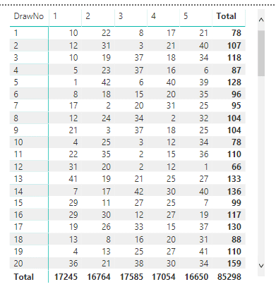
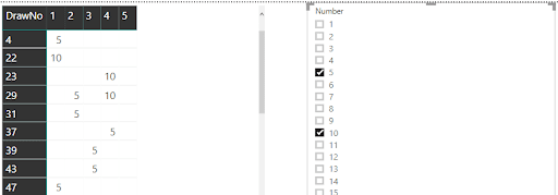
We will use the Matrix visual as an example to illustrate some interesting techniques. The example data is a list of numbers drawn from the Maltese lotto. Each record is one number from a drawing, and each drawing has five records, one for each of the five numbers.The numbers for each drawing can be displayed as a single line using the Matrix visualisation, as shown in this figure.
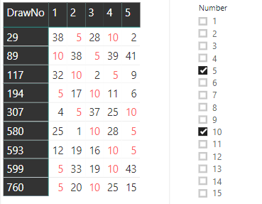
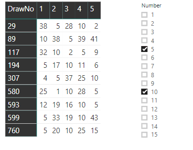
The goal is to have a slicer that filters rows based on the number or numbers selected. If you choose 5 and 10, for example, the rows that contain those numbers will be displayed:

You can also use conditional formatting to make the selected numbers glow in a colour of your choosing.
Each row in the table represents a single number drawn in a single lotto drawing. Since each drawing has five numbers, the table includes five records for each drawing. Lotto is the name of the table, and the following fields are the most important in this example:
DrawNo: The number of the drawing
DrawOrder: The order of the drawn number
Number: The drawn number
Begin by creating a new Power BI dashboard and then importing the csv file. You can also use the MatrixSimpleStart.pbix file included in the zip file as a starting point.
Matrix Creation
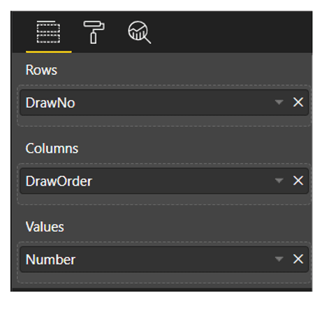
There are three fields to configure in the Matrix visual: the field for the rows, the field for the columns, and the values' field. A single drawing with the five numbers should be shown on each line of the visual. As a result, the DrawNo field will be used to aggregate the drawings on each row.
How do you show five records on each line when each drawing has five records, the five drawn numbers? The columns' title will be decided by the content of the field you select as a column field. The best choice is easy: "DrawOrder". Each row shows the "DrawNo". Each column has the "DrawOrder" as a title and will show the drawn "Number" as a value in the column.
Follow a quick sequence of steps to configure the Matrix visual once you've opened the file MatrixSampleStart.pbix or imported the csv file. You'll be working in Report view.
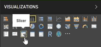
a. Add a “Matrix” visual to the report from the “Visualizations” pane.
b. Drag the three fields, "DrawNo", "DrawOrder", and "Number", to the appropriate slots in the "Fields Pane".
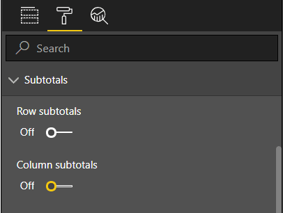
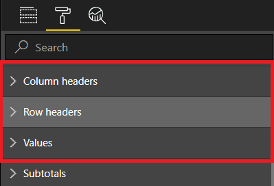
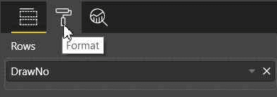
c. In the “Visualizations Pane”, with the matrix selected, click the “Format” button and disable the subtotals for rows and columns as they are not needed.

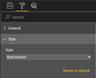
d. While still in the “Format” tab, under the “Style” option, change the style of the matrix. You can choose any available style; I suggest “Bold Header”.

Power BI Training
- Master Your Craft
- Lifetime LMS & Faculty Access
- 24/7 online expert support
- Real-world & Project Based Learning
e. Still in the “Format” tab, change the font size under these three different options: “Row Headers”, “Column Headers”, and “Values”. I like to use 12 as font size.
The completed Matrix should look like this:

Creating a Slicer and Filtering the Matrix
Since the matrix includes numbers from lotto drawings, filtering the drawn numbers and only displaying the drawings with the selected drawn numbers is the right choice for a slicer.
There are three possible approaches to create a slicer:
- Build a slicer based on the table's original fields (Lotto).
- Build a slicer based on a new measured table by transforming the original table into a new one using a DAX expression.
- Make a slicer based on a What-If condition.
Note that DAX is an expression language used in tabular models, such as the Power BI model, to allow for calculations to be done on the model.
The first two options maintain a connection to the original table (Lotto). Although this relationship does not affect the outcome, it does cause a minor bug. The slicer must be placed before the matrix on the page. Some slicer configurations will be unavailable if the slicer is inserted after the matrix. First, the slicer must be inserted.
Creating a Slicer from the Same Table
The simplest way to add a slicer is from a table field. Unfortunately, in this case, it does not quite provide the answer. To see how to add a slicer based on the table, follow these steps:
a. Drop the matrix.
b. In the “Fields Pane”, select the “Number” field in the Lotto table.
c. In the “Visualizations” Pane, change the visual to “Slicer”.
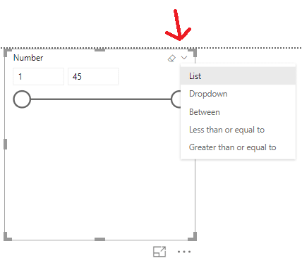
d. Change the slicer format to “List” in the slicer style option within the slicer.
f. Repeat the steps in the “Create the Matrix” section to recreate the matrix.
Select two numbers in the slicer, such as 5 and 10, and look at the result in the matrix to evaluate this solution. You'll note two issues:
- Instead of showing all of the numbers from the chosen draws, the draws are filtered to display only the selected numbers. This isn't the best outcome for this problem.
- The multiple choices act as an OR rather than an AND. Only one of the two chosen numbers appears in the drawings.
Fixing the Selection
A different approach to this problem is needed to address the range. The model and visual engine in Power BI build the filter automatically, displaying only the selected numbers. To display all of the chosen draws' numbers, you'll need to disable the automatic filter and construct a DAX formula to decide which ones should be displayed.
This takes us back to the decision on how to design the slicer: building the slicer directly from the draws table (Lotto) establishes an inevitable relationship. The only slicer option that won't work is this one. The relationship to the source table (Lotto) can be managed if you construct the slicer from a calculated table or What-If parameter, avoiding the filtering.
You can construct a DAX formula to filter the drawings if the slicer does not directly filter the matrix. The expression would compare the numbers on the current drawing row to the slicer's chosen numbers to decide whether the row should be displayed.
Next, you'll see two alternate ways to render the slicer, both of which include the use of a helper table. You have the choice of using either method.
Creating the Slicer – Calculated Table
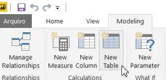
An essential DAX expression can be used to build this table. A button named "New Table" can be found on the top menu, "Modeling" tab. After you click this button, space expands in which you can type in the DAX expression for this table.
Call the table “Selector”. The expression is very simple:
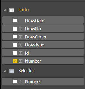
Selector = VALUES (Lotto[Number] )
Selector, the newly created table, would be unrelated to the original. The only impact would be the strange visual action that allows the slicer to be generated before the matrix, considering the fact that it was created from Lotto rows.

Subscribe to our YouTube channel to get new updates..!
You must perform the following steps if you chose this choice for the “Selector” table:
- Drop the slicer.
- Drop the matrix.
- Create the slicer again using the steps from the “Creating a Slicer from the Same Table” section but use the “Number” field from the “Selector” table.
- Create the matrix again.
The slicer will not filter the data at this point. Please keep reading to figure out how to make it sort the matrix.
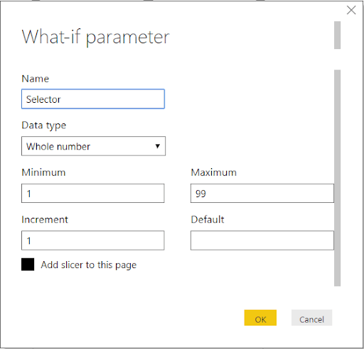
Creating the Slicer from the What-if Parameter
It would be best to create a “What-if” parameter instead of creating the “Selector” table based on the Lotto table. This is a new table with no relationship to the Lotto table. If you used the table in the previous section to build the Selector, delete it before proceeding.
a. Delete the matrix
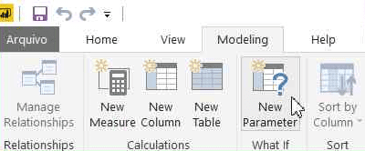
b. To open the "What-if Parameter" window, go to the top menu, "Modeling" tab, and press the "Create Parameter" button.
2. Click “OK” once the properties have been filled in.
Behind the scenes, the following DAX formula is generated:
Selector = GENERATESERIES ( 1, 99, 1 )
In the Fields pane, you'll find a new measure:
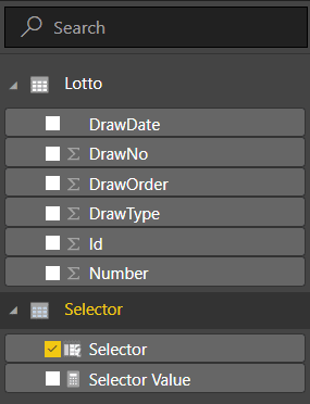
You should rename the "Selector" field to "Number" to make all options the same. It's not necessary, but if you don't, the following expressions would need to use Selector[Selector] instead of Selector[Number] to apply to this field.
The steps to rename this field:
- Click the ‘...' (More Options) button in the "Fields" pane, next to the "Selector" field, under the "Selector" table.
- In the context menu that appears, select the "Rename" menu item.
- Change the name of the area to “Number”.
Follow these steps to complete the slicer
- To format the new slicer that will be automatically added to the report, repeat the formatting (steps 4 and 5 in “Creating a Slicer from the Same Table”).
- Recreate the matrix as described in the section "Creating the Matrix."
Continue learning how to get the slicer to work filtering the matrix if you choose this method for the slicer.
Discriminating Measures and Calculated Columns
Before moving on, it's essential to consider why you should build measures rather than calculated columns. DAX expressions are accepted in both measures and calculated columns. They do, though, vary in a few respects. Measures are used on aggregations row by row while the calculated column expression is analysed in the row context.
Another crucial distinction, and generally the most simple one to remember when making a decision, is when the calculation is performed. As the table is processed, the calculated column expressions are evaluated, and the result is preserved in the Power BI file. They can't rely on any contact with the visuals because they've already been calculated.
This simplifies the decision: you'll need steps that respond to the slicer range as the consumer makes it. Another explanation is that these measures would be calculated on each line of the matrix, essentially an aggregate of five records.
Creating the Measures for Filtering
To sort the rows depending on the chosen numbers, you'll need to build a single measure to see if each row on the slicer has the specified numbers. It's a boolean variable that can return true or false, but here's the trick: Since boolean measurements for filtering don't fit well in Power BI, you'll need to build it as a numeric measure that returns 1 or 0.
Another problem with this formula is that it shows all rows while the slicer has no selection. In this case, the test should return 1 for all rows, implying that it is displayed.
This calculation will be determined for each row of the matrix, which is made up of five numbers. The slicer, on the other hand, would have a series of numbers that you don't know how many there are.The result should be 1 (show the line) if any of the slicer's numbers are contained in the drawing numbers in the row, otherwise 0.
You will use a DAX expression to build variables within the expression, which you can use to solve this problem. Here's where the expression starts:
LineFilter =
VAR tab = VALUES (Selector[Number] )
VAR tab2 = VALUES ( Lotto[Number] )
VAR common = INTERSECT ( tab, tab2 )
VAR rowsCommon = COUNTROWS ( common )
VAR rowsSelected = COUNTROWS ( tab )
It's vital to consider the context in which this expression was processed. Since the expression will be analysed on each line of the matrix, the Values function over the Selector table will return either the numbers chosen on the slicer or all the numbers, while the Values function over the Lotto table will return only the numbers over the current drawing line.
If the rowsCommon variable is equal to the rowsSelected variable in the final part of the expression, all numbers selected on the slicer are on this drawing, and the result is 1.Otherwise, it will be 0.However, you should consider whether the slicer is filtered at all. You can use the ISFILTERED DAX function for this.
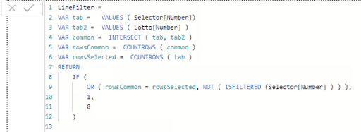
The full DAX expression is:
LineFilter =
VAR tab = VALUES ( Selector[Number] )
VAR tab2 = VALUES ( Lotto[Number] )
VAR common = INTERSECT ( tab, tab2 )
VAR rowsCommon = COUNTROWS ( common )
VAR rowsSelected = COUNTROWS ( tab )
RETURN

    IF (

        OR ( rowsCommon = rowsSelected,

          NOT ( ISFILTERED ( Selector[Number] ) ) );

        1,

        0

    )
The steps to use this expression are the following:
a. In the “Fields” pane, Click the ‘…’ (More Options) button close to the “Lotto” table.
b. Click the “New Measure” menu option in the context menu that will appear.
a. Paste the entire expression, including the measure name, in the formula bar.
a. Drag the newly generated measure to the matrix configuration's filter area.
b. Change the comparison expression Show items when the value to is
c. Fill the value expression with 1.
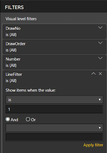
d. Click Apply Filter
The filter will be operational after you've finished these steps. When you use the slicer to choose multiple numbers, you'll just see the draws that include all of the numbers you've chosen.
Conditional Formatting
The conditional format is the "cherry on top" of this solution. You can not only filter the drawings, but you can also use a different color to highlight the numbers chosen on the slicer inside each line.
The slicer's numbers can show in red or whatever color you choose. For conditional formatting, this is too complex. As a result, you'll need a new metric that tells you whether or not each number in the drawing is chosen.
This calculation will be processed for each number rather than collections of numbers, so it will only be used for conditional filtering. However, since it's a metric, you'll need to use an aggregation function on the "Number" field, which can be as simple as SUM.
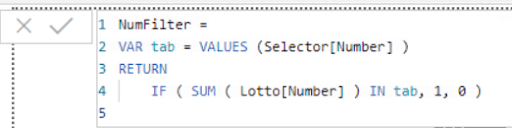
The final measure will look like this:
NumFilter =
VAR tab = VALUES (Selector[Number] )
RETURN
IF ( SUM ( Lotto[Number] ) IN tab, 1, 0 )
The steps to complete the conditional formatting are:
a. In the “Fields” pane, click the ‘…’ (More Options) button close to the Lotto table.
b. Click the “New Measure” menu option in the context menu that will appear.
c. Paste the entire expression, including the measure name, in the formula bar.
IMG27
a. In the “Visualizations” pane, open “Conditional formatting”.
b. Under the “Conditional Formatting” element, enable “Font color” option.
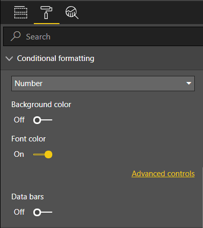
a. Click on the “Advanced Controls” link that will appear below the “Font color” option.
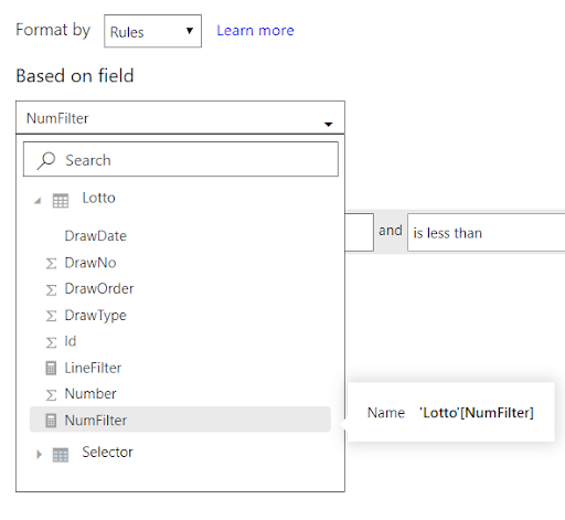
b. In the “Font color” window, on the “Format by” dropdown box, select “Rules”.
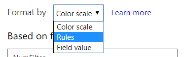
On the “Based on field” dropdown box, select the measure, “NumFilter”.
a. On the “If value” dropdown box select the “is” option.
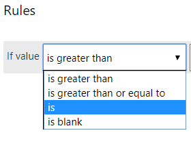
2. Select “Red” in the color picker, if not selected already.
3. Click “Ok”.
Once you've finished the steps, the chosen numbers should light up in red or the colour you choose.

Conclusion:
Each line of a matrix may be filtered according to a slicer using some sophisticated DAX expressions. Furthermore, the numbers chosen may be highlighted. By using the Matrix visual, you can apply the expressions presented here to your challenges.
Related article:
About Author
Upcoming Power BI Training Online classes
| Batch starts on 17th Jul 2026 |
|
||
| Batch starts on 21st Jul 2026 |
|
||
| Batch starts on 25th Jul 2026 |
|