
Gauge Chart in Tableau
Last updated on Jan 24, 2024

Gauge Chart in Tableau - Table of Content
- What is a Gauge Chart?
- When to use a Gauge Chart?
- How to Create a Gauge Chart in Tableau?
- Creating the Donut chart and Calculated Fields
- Advantages and disadvantages
- Some of the disadvantages of gauge charts include
What is a Gauge Chart?
A gauge chart is a type of chart used in data visualization to display a single value with its quantitative context. It resembles a speedometer and usually tracks different progress of given KPIs against the user's target. it normally deals with progressive values and uses multiple colors to divide the information into different parts for easy interpretation and understanding.
Gauge charts help individuals to compare variables using several needles on one or more gauges. When dealing with PDF and HTML, it can support up to 16 pies. Most individuals use these charts in their daily data analysis to find out different metrics on their data.
It has a needle that points to a particular pivot point value. Most of the colors indicate a particular value, i.e., maximum, minimum, medium, e.t.c. to have a faster visualization of the data needed. Executives use them to create dashboards. The visualizations are useful for many people, from businesses, business owners, and employees, and how the metrics collected can help them.
When to use a Gauge Chart?
1. Make the Dial
First, you create the data source which you will use, it has columns and values. After getting the data source, you connect it to the Tableau data source and then extract it. Create new parameters that help in sizing the size of the gauge dial. You can now set your parameters together with the ranges you will use in your project.
The parameters can be the size or width, while the range you can choose the numbers, i.e., from 7-10. After selecting the parameters, you now perform the calculations to help make the dial. After creating the dial, you map the layers to the colors and change their shapes. It will change the overall dial into a gauge.
2. Make the ticks
When creating the ticks, you need a data source, and you also need to create parameters and perform some calculations. You make calculations depending on the parameters you have. Once you have the calculations, you map all the calculations to the sheet and map them to the map layer. You can play with parameter size and measurements to change the dial sizes.
3. Make the pointer
We use pointers when we want to create a relationship between the data source and secondary data source. All you need is to create a CSV file that has a specific range. After that, create a join between the two data sources, but you can also work with many to many relationships.
Become a UiPath Certified professional by learning this HKR Tableau Training!

Tableau Certification Training
- Master Your Craft
- Lifetime LMS & Faculty Access
- 24/7 online expert support
- Real-world & Project Based Learning
4. Add the labels
We use the labels to show the tools or values in the chart. We use different parameters to get the right dimensions. When creating calculations, we can use different metrics. Some of the metrics target different labels. You can use labels on any text and even to the extent of formatting the texts.
5. Add Labels
Some of the labels we can add include titles, KPI names, e.t.c. You can also change the mark types into different texts. Create the new parameters and set their values. Create new metrics and add labels and values. Add different calculations to the map layers considering the metrics and targets of the text.
6. Finalize your Visualization
During this stage, there is a lot of data cleaning. You also have to check the points map layers to ensure it matches the labels of the map layers. You have to ensure the gauges are located above your visualization labels. You must ensure the dial's colors are great for the users for easy transportation. You can also select the background maps if you like. You can also improve the mapping and formatting.
You can also change the axes and remove lines, rulers, dividers, ticks, e.t.c. After adding the gauges, you can add them to the dashboard and ensure it is good-looking.
How to Create a Gauge Chart in Tableau?
One must follow several steps when creating a gauge chart in Tableau.
- Locate your data source and load it into Tableau.
- Right-click on your data source, and under the Edit Data Source option, paste the path and position data.
- If you get an error of no joining column, you will have to click on Add new join clause, navigate to Create Join Calculation, where you have to put 1, and then click on the OK button to create join closures.
- It's now the turn to create fields, parameters, and bins. For each parameter, you must set the name as Line Value, Large Every X, or both. Choose the integer as the data type. When selecting the range of Allowable values, we use minimum, maximum, and current values. For the bins, you right-click on the Path option, choose the Bins and then Edit Bins, where you can change the field name to path, the bin size to perimeters, and then click the OK button.
- Other options you have to select are index, TC_Position, TC_Step Size, TC_Extend, TC_Color, and the X and Y axis.
- The next step is to build the worksheet. You have to change the mark types, the data, and the path into rows, create the rows and columns, and change the colors using the color mark.
- You then perform different adjustments on the axis, dividers, and zero lines by hiding and reversing some of them.
- Perform different changes on the panel, and then you are good to go, and the gauge charts are ready.
Want to know more about UiPath,visit here Tableau Tutorial!
Subscribe to our YouTube channel to get new updates..!
Creating the Donut chart and Calculated Fields
There are several steps that one can follow when creating donut charts. Some of the steps include:
- Navigate to the rows section and create two fields by clicking on the avg(0) rows section and hitting Enter.
- Create another new field using the step above.
- Choose the mark type for all the fields created, and you can use the piecharts, and different labels, aiming for other necessities.
- Perform different calculations like SUM, Percentage, e.t.c. Under the Marks category, choose the Circle option and use it as your preferred mark type.
- Use the color card to give the circle your preferred color choice.
- You can now add more fields to the label and ensure you have more than three options.
- Under the rows option, choose the Dual axis to combine the two charts and proceed to the next step.
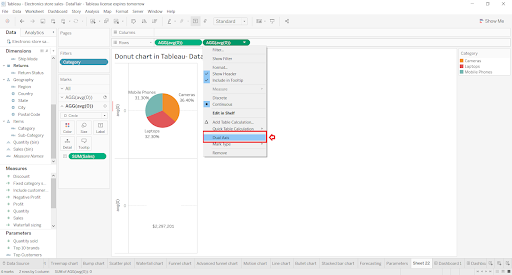
- Under the size card, play with it to achieve your desired circle size.
- Finish creating your gauge charts; you should have a chart with labels and sections well done.
Become a Tableau Certified professional by learning this HKR Tableau Training in Houston!
Advantages and disadvantages
Advantages of using gauge charts include:
- The gauge charts are easier to use and understand. It is due to how they represent their data by incorporating different factors like time, comparisons, proportions, e.t.c. Tracking different metrics and goals in business and other fields is easy.
- The charts are very accurate, making it too good to use them when making different calculations, i.e., calculating the size. They help those in the manufacturing business to get the right specifications.
- They are precise, making their measurements match the decimal places on the charts.
- When dealing with specific data, you can notice the linear progression of different fields without any errors or issues.
- The data used in gauge charts are very clear, making the users understand the charts easily. The clarity improves and makes the users understand the sizes of the objects and parts.
Top 30 frequently asked Tableau Interview Questions !
Some of the disadvantages of gauge charts include:
- Some users can face difficulties when reading the charts.
- Sometimes it's misleading when using them in your respective field. When drawing the gauge charts, you can view that the data is small, which can lead to misunderstanding.
- It requires expertise to create. Many people struggle to find the right data they will use to create gauge charts and require one to create charts representing the data.
- When there are several changes in the variables, it is difficult to notice any changes that occur.
Conclusion
There are several ways you can use to create gauge charts. Most of them work with multiple datasets and are good in business and manufacturing. Gauge charts in Tableau are useful for data sources, and you can use them for generating real-time data. They are good tools for data analysis.
About Author
Upcoming Tableau Certification Training Online classes
| Batch starts on 28th Jul 2026 |
|
||
| Batch starts on 1st Aug 2026 |
|
||
| Batch starts on 5th Aug 2026 |
|
FAQ's
One needs to follow several steps when creating a gauge chart in the tableau. Some of the steps involve changing paths, changing color, axis, labels e.t.c
Tableau supports gauge charts by visualizing different data fields and metrics to provide a better context.
A gauge chart is a type of visualization for displaying different data values to provide a better context.
Gauge charts use needles to match the data to provide more data context and look like a speedometer.